A lot of things was packed to our latest update for iOS & watchOS. Let’s go them through.
Apple Watch always-on screen
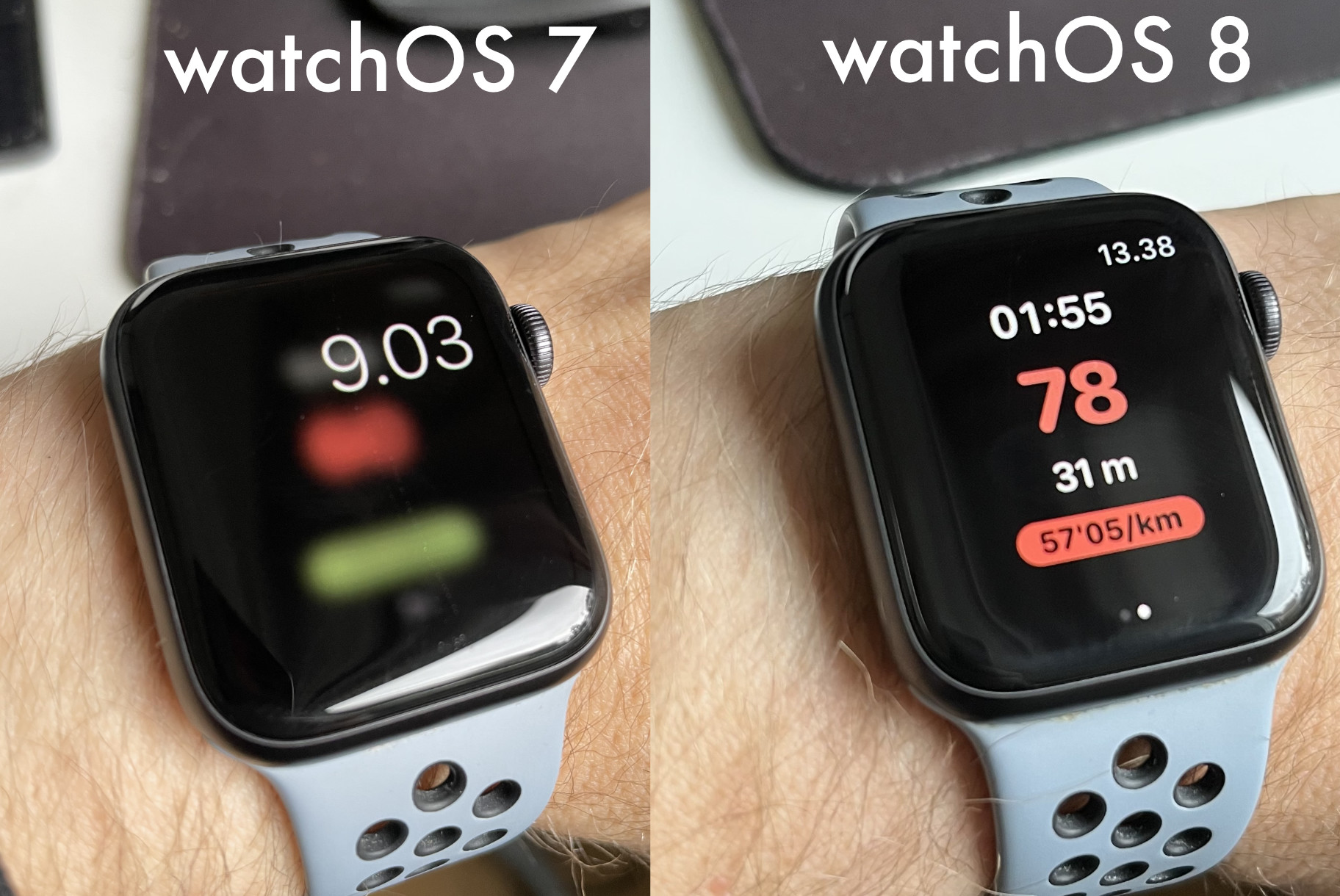
Most user-noticable feature for our Apple Watch users must be the support of always-on screen for the latest Apple Watches. Currently, that covers series 5, 6 and 7. Thanks to watchOS 8 3rd-party support, we are now able to display the running screen all the time on the watch. Compare our behavior before and after the change.

Search & revamped courses screen

Courses screen underwent some UI improvements.
First, there is an iCloud status now accessible on the top-left-corner. You can see when the iCloud syncing happened and if there were any issues.
Second, there is a search bar. You need to have iOS 15 for this. You can do a search for course name and the courses matching the search will be displayed.
Third, you can change the thumbnail size from 3 different sizes as you please. (For iPhone SE 1st gen users there are 2 sizes)
Fourth, the new run button has been moved as a floating action button to the bottom of the screen. It is always accessible. For the iPad we moved to a sidebar layout, where the new run/import options are visible on the left and also always accessible.
Redesigned calibration
When doing our Android version of the app, we landed on some slightly different flow on how to do the calibration of the map image. In the 2.9 version we finally decided to take the same approach to the iOS.
Calibration flow is mostly the same as before with some small key differences:
- There is no more Move button and instead you will move the whole track when you have only one marker point in the beginning. We thought this should be anyway thing that you do only once in the beginning and you don’t return to it after that.
- Adding the new point no more places it randomly. Instead you tap the Add button, and then tap on the track to place the new point. Also, there is no more zooming into that new random location. We feel the user is much more in control 😉 of the flow now.
- Remove button is more discoverable now at the bottom.
- There is a video tutorial, which you can open at any time from the top button.

We got some feedback on the calibration difficulties this year and we are hoping that these improvements as well as the new video tutorial will answer most of the questions and help with the difficulties. We are not stopping here, there are other plans on how to improve the calibration also but we’ll hope this helps you short-term.
What If improvements

For our Total Control users, we also slightly improved the What If. The UI flow is more clear now, user adds points and can undo the last point. Also the added points are visible in a list with their estimated times.
Biggest improvement is that now you can select the average pace for the alternate route. The default is the average pace that was taken along the whole route but if you think that this particular part would have been faster or slower to run than the average, you can estimate your pace here and that is then included in the calculation.
Smaller improvements
Couple more to mention:
The course image sharing now remembers your settings for the track width, border width, opacity and point size.
The new run recording on iPhone/iPad has a bit nicer user interface. You can now also see the pace with color-coding like in the Apple Watch app.
Onboarding has been renewed as well. We thought it was not mandatory to give the location permission or health permissions right there at the start unless you have an Apple Watch. Location permission is now asked only if you have a paired Apple Watch or until you start on-device recording. Health permission is asked on the Apple Watch or if you are importing tracks from Apple Health.
Hope you will like the update!